Reading Time: 2 minutes

OVERVIEW

World Wide Fund for Nature is one of the world’s leading environmental organisations, operating across more than 100 countries to protect wildlife, conserve natural habitats, and confront critical ecological challenges. The organisation is recognised for combining scientific rigor with compelling storytelling, using clarity and purpose to mobilise communities, policymakers, and donors toward lasting environmental impact.
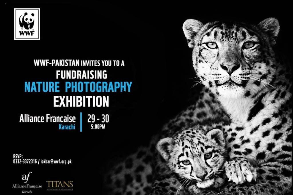
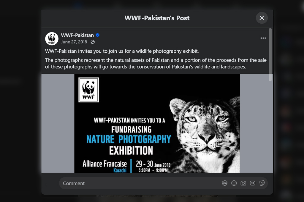
Within this global mission, WWF-Pakistan presented Winter White and “Woods” Watercolor as a nature photography exhibition grounded in conservation, restraint, and emotional clarity. The initiative focused on raising awareness and funds for the protection of Pakistan’s biodiversity, using visual storytelling to connect global environmental urgency with local relevance. Design and conservation worked in quiet alignment, allowing aesthetics to reinforce meaning without competing for attention.

THE CLIENT

WWF-Pakistan sought event materials that upheld international brand standards while resonating with local donors, stakeholders, and photography enthusiasts. Creative freedom was entrusted with the expectation that every design decision would respect the organisation’s identity and communicate the urgency of its mission. The emphasis was on inspiration rather than persuasion, creating trust through clarity, authenticity, and purpose-driven design.

WWF
Regional Head
Corporate Partnerships & Fundraising
Pakistan

THE PROJECT

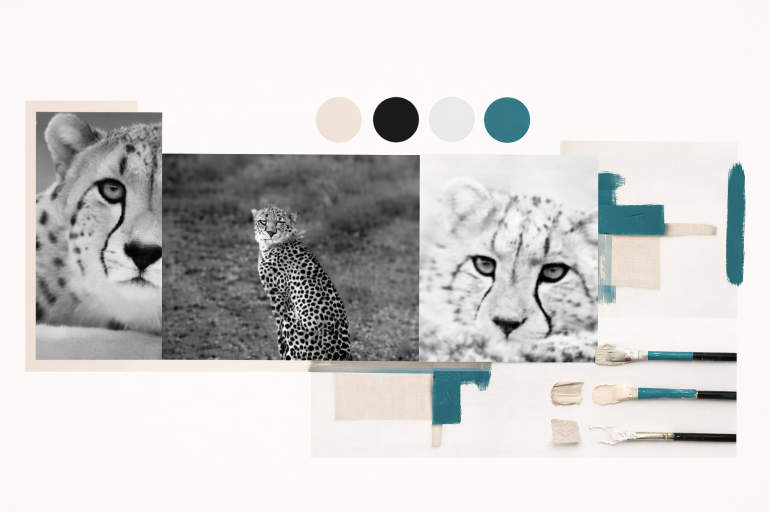
  • Colour Stratergy Design
  • Print Design
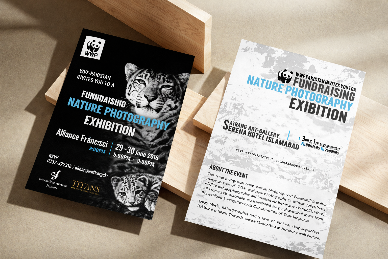
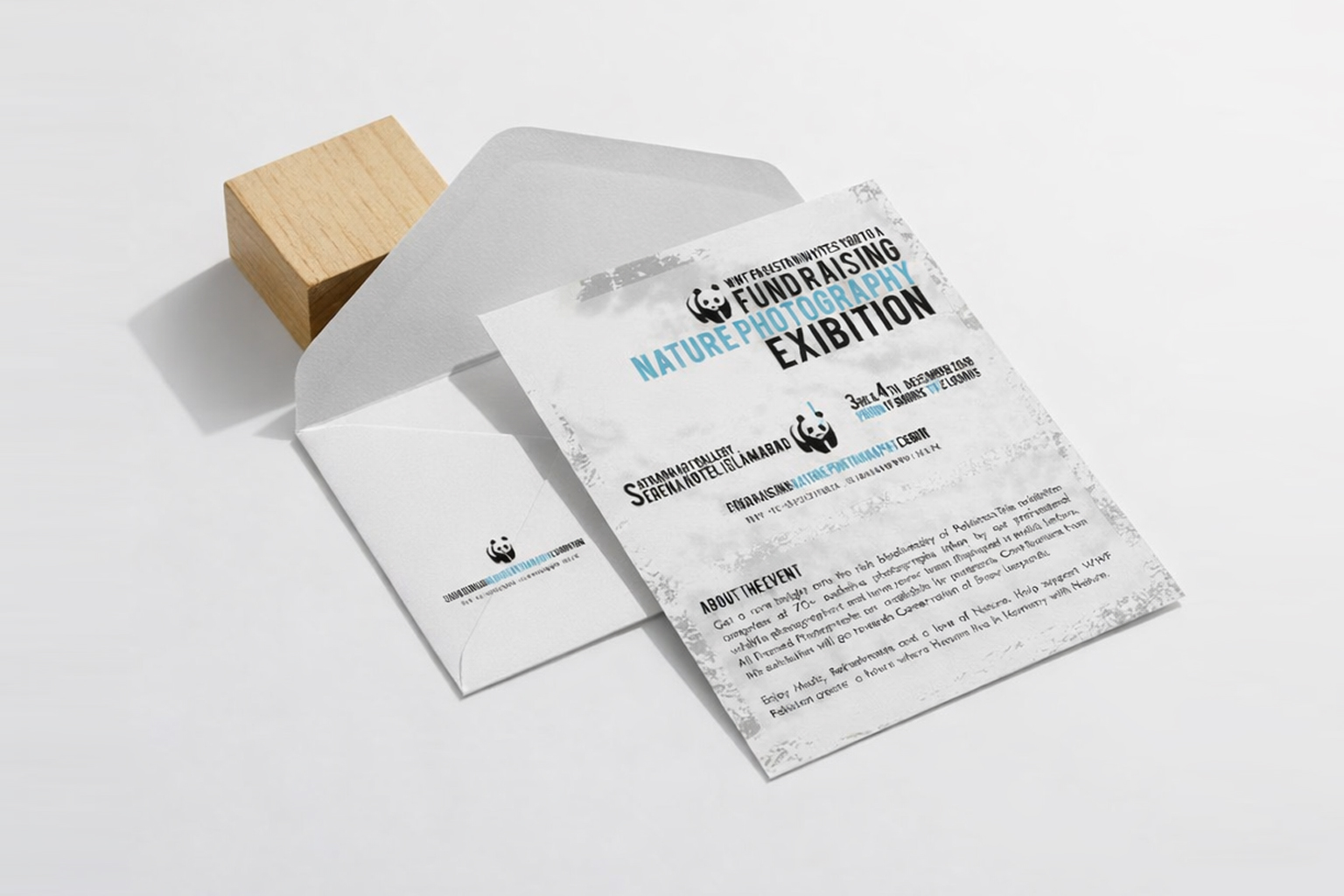
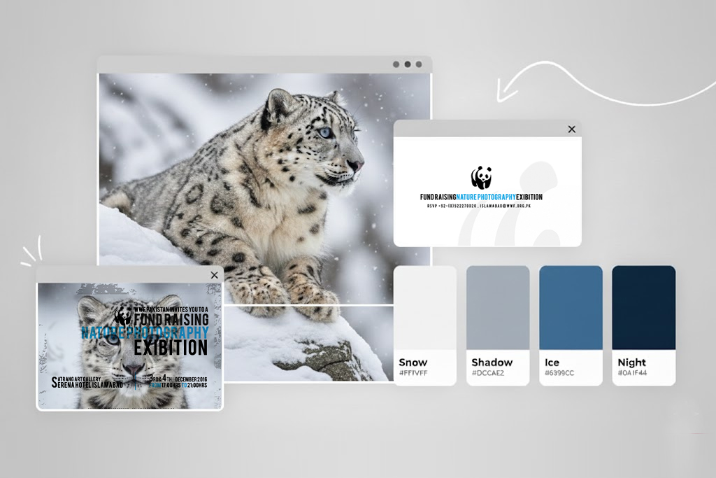
The project delivered a combined invitation and entry card, designed front and back with a refined break-away section for event information, alongside a structured exhibition agenda. Inspired by Pakistan’s endangered glaciers and the snow leopard, the visual language adopted a clean, winter-white aesthetic, using crisp whites and a single blue accent to symbolise fragility and focus attention where it mattered most. Bold, modern typography introduced a sense of urgency, while disciplined layouts ensured readability and calm.
Guidance extended beyond design into print considerations, ensuring material quality matched intent. The result was a cohesive set of exhibition materials that balanced visual restraint with emotional impact, amplifying WWF’s message and reinforcing the power of design as a quiet catalyst for change.