“The cleanest website is not the one with nothing on it. It is the one with nothing wasted.” Why the post-hype web belongs to brands that can edit themselves
Sustainable Digital Minimalism: The Post-Hype Web
Why fast, low-carbon, privacy-first websites may become the sharpest digital strategy of 2026
The internet is no longer light.
It only pretends to be. We still talk about the web as if it floats somewhere above us, clean and invisible, a frictionless layer of modern life. But every page has a body. Every image has weight. Every tracker makes a request. Every animation asks for processing. Every AI-generated article adds another corridor to the digital shopping mall nobody wanted to walk through.
For years, the logic of web strategy was simple: add more. Add more pages. Add more popups. Add more analytics. Add more funnels. Add more pixels. Add more motion. Add more personalization. Add more AI. Add more “engagement.” Add more content because content is cheap now and the machine must be fed. But a strange thing happens when everything becomes easy to generate.
Restraint starts to look expensive. A fast website now feels almost luxurious. Not because it is empty, but because it is controlled. It does not beg. It does not chase. It does not arrive with twelve scripts, three banners, two chatbots, and a carousel trying to prove the brand has a pulse. It opens and says what it means. It lets you leave. This is the soft rebellion of the post-hype web. Not anti-technology. Anti-waste.
The Internet Became a Department Store With No Exits
Somewhere between growth marketing and AI content, the web forgot the visitor.
The modern website has become a very polished form of nervousness. Every corner wants to prove something. The sticky header follows you. The newsletter box interrupts you. The chatbot waves at you. The cookie banner blocks you. The retargeting pixel remembers you. The blog section keeps producing essays no one at the company has truly read.
This is what happens when strategy becomes accumulation. The website stops being a place and becomes a system of traps. Marketing wants data. Sales wants forms. Leadership wants “wow.” Agencies want case studies. Developers inherit the stack. Users inherit the delay.
Maciej Cegłowski saw this early in The Website Obesity Crisis, his sharp and funny critique of a web that kept confusing bigger with better. Dan Luu made the cost even clearer in How Web Bloat Impacts Users With Slow Connections, where the issue is not abstract design taste but real people on real devices waiting for unnecessary code to load.
The web did not become bloated by accident. It became bloated because every department got a vote and nobody was assigned the courage to remove things. Then AI arrived and gave the whole machine a printing press. Now the bloat is not only technical. It is editorial. The web is filling with sentences that sound correct but feel unowned, pages that exist because keyword software found a gap, and articles written to satisfy a search engine that may soon answer the question without sending anyone to the site at all.
Fast Is the New Luxury
Speed is not a feature. It is a form of respect.
Luxury online used to mean spectacle. Hero videos, heavy transitions, custom cursors, cinematic scroll, and interfaces that behaved like they were auditioning for a design award. But taste moves in cycles, and the web is tired.
A fast website now feels expensive in the way a quiet restaurant feels expensive. There is no panic in it. No fluorescent demand for attention. No sense that the brand is trying to compensate for weak positioning with motion blur. It simply works.
The HTTP Archive Web Almanac frames page weight as a practical proxy for performance and access. That matters because a heavy website is not just slower. It is less democratic. It punishes old phones, weak networks, limited data plans, older devices, and people who do not happen to browse from a perfect desk setup.
Tammy Everts and the team at SpeedCurve have been making the business case for years: page bloat affects Core Web Vitals, user experience, search visibility, and conversion. In other words, speed is not just engineering hygiene. It is commercial discipline.
A slow website says: we built this around ourselves. A fast website says: we thought about you first. That is why the fastest web wins. Not because users care about your performance dashboard. They care because waiting feels like disrespect. They care because their phone is hot. They care because every second of delay reminds them that somewhere, someone chose another script over their time.
Carbon Is Now a Design Material
The web is not weightless. Its damage is just hidden from the screen.
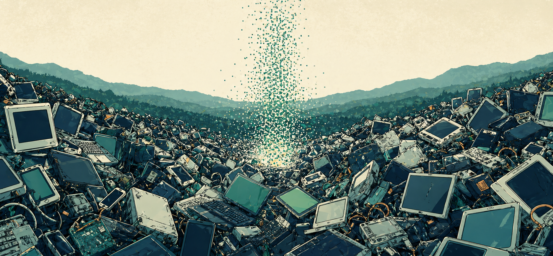
Digital work has long enjoyed a flattering myth. No paper. No shipping. No shelves. No smoke. So it must be clean. But the web lives in data centers, cables, devices, batteries, cooling systems, electricity grids, server farms, minerals, factories, and networks. The cloud is not a cloud. It is someone else’s machine using someone else’s energy in someone else’s landscape.
Tom Greenwood’s Sustainable Web Design is essential here because it turns sustainability from a vague virtue into a working practice: measure impact, reduce transfer, optimize images, question content, choose hosting carefully, and make environmental performance part of the design process.
Tim Frick’s Designing for Sustainability widens the frame, connecting sustainable design to business systems, user experience, content strategy, and digital operations. Gerry McGovern’s World Wide Waste is more severe, and usefully so. His argument is simple: digital waste is still waste, even when it arrives beautifully lit.
This is the part many brands still misunderstand. A low-carbon website is not a moral badge placed in the footer. It is a way of building. Compress the images. Remove dead pages. Stop autoplaying video by default. Use system fonts where custom type adds nothing. Reduce third-party scripts. Stop installing tools nobody checks. Cache properly. Design for clear journeys, not decorative wandering. Use green hosting where possible. Kill the pages that exist only because a content calendar was anxious.
The most sustainable feature is often the one you never ship.
The Low-Tech Web Was Right Earlier Than Everyone Else
The future sometimes arrives disguised as subtraction.
One of the most elegant references in this conversation is not a luxury brand, a venture-backed SaaS platform, or a glossy design studio. It is Low-Tech Magazine.
Kris De Decker and the Low-Tech Magazine team built a solar-powered version of their website that makes the physical reality of the internet visible. It uses a static setup, compressed images, default fonts, and even shows battery status. If there is not enough energy, the site may go offline.
In the always-on culture of the web, that feels almost scandalous. But it is also beautiful. Low-Tech Magazine is not primitive. It is honest. It refuses the fantasy that digital systems have no body, no weather, no energy source, no limit.
That is why it has become such a useful symbol. The low-tech web is not against design. It is against denial. It reminds us that every website has an ecology. A page is not just content. It is infrastructure, energy, dependency, maintenance, and consequence.
Privacy-First Is the New Quiet Confidence
Surveillance was never the same thing as understanding.
The tracking-heavy web was built on a strange assumption: if we watch people closely enough, we will know what they want. So websites became little surveillance theaters. Pixels, heatmaps, fingerprinting, cross-site tracking, behavioral scoring, retargeting, cookie banners written like hostage notes, and consent interfaces designed less to inform than to exhaust.
Shoshana Zuboff gave the broader system its name in The Age of Surveillance Capitalism. Her work is not about web design specifically, but it explains the business atmosphere that shaped much of the modern internet: data extraction disguised as convenience.
For brands, the lesson is uncomfortable. A website does not need to behave like a detective to sell well. It needs clarity, trust, usefulness, speed, strong positioning, honest calls to action, and content with a human reason to exist.
The 2025 Web Almanac Third Parties Report shows how deeply third-party services are embedded across the web. That is not only a performance issue. It is a governance issue, a privacy issue, a dependency issue, and a brand issue. Every third party asks a question the company should be able to answer: why is this here? If nobody knows, remove it.
Privacy-first design is not anti-marketing. It is mature marketing. It accepts that trust is not built by following people everywhere. It is built by being worth returning to.
AI Made Editing More Valuable Than Publishing
When everyone can generate more, the scarce resource is judgment.
AI did not create web bloat. It industrialized it. Before generative AI, bad content at least required effort. Now entire libraries of bland usefulness can be manufactured in an afternoon. The language is clean. The headings are logical. The tone is professional. The article says very little, but it says it fluently.
This is why the post-hype web needs editors more than generators. Cal Newport’s Digital Minimalism is useful here because it frames technology around intention rather than novelty. Nicholas Carr’s The Shallows gives the older warning: digital environments do not just deliver information. They shape attention. Jenny Odell’s How to Do Nothing adds the cultural counterpoint: refusal can be a serious act when the surrounding system is built on capture.
Gartner has predicted that traditional search volume will drop by 25% by 2026 as AI chatbots and virtual agents reshape discovery. That is a serious warning for brands still treating SEO as a volume game. If users increasingly receive answers without visiting websites, then publishing more weak pages becomes less of a strategy and more of a residue.
The question is no longer how much can we publish. The question is what deserves to exist. What deserves to load? What deserves to be indexed? What deserves energy, maintenance, bandwidth, and the user’s attention?
Sustainable Digital Minimalism is not anti-AI. It is anti-sludge. Use AI to audit, compress, summarize, test, translate, compare, and clarify. Use it to find repetition. Use it to remove friction. Use it to make the web lighter. Do not use it to bury your website under a thousand pages of synthetic competence.
The New Beautiful Is Almost Bare
After years of digital glare, the eye wants air.
There is an aesthetic shift happening too. The web has spent years bathing itself in gradients, glass effects, animated blobs, fake depth, neon SaaS palettes, scroll-triggered drama, and layouts that seem desperate to prove they were designed. Now the eye is asking for air.
Pantone’s Cloud Dancer, its 2026 Color of the Year, fits this mood almost too neatly. An airy white. A pause. A surface that refuses to shout.
But the real shift is not just color. It is posture. The best new websites may feel more editorial than promotional. More gallery wall than casino floor. More Margiela than mall kiosk. More Muji than Times Square. More index than spectacle. More silence than sales panic.
White space becomes more than style. It becomes evidence of confidence. A restrained interface says: we do not need to trap you here. A quiet page says: the work can stand without fireworks. A fast site says: the brand has self-control. And self-control, in an age of infinite generation, is a very expensive signal.
The W3C Just Made This Less Optional
Sustainability is moving from taste to standards.
For a long time, sustainable web design lived in the margins of the industry. A few agencies cared. A few developers cared. A few designers wrote essays. A few clients saw the connection between performance, ethics, and brand trust. Now the conversation is becoming more formal.
The W3C Web Sustainability Guidelines, published as a Group Draft Note in 2026, frame web sustainability through planet, people, and prosperity. That matters because it moves the subject beyond “green branding” and into the architecture of how the web should be made.
This is the important shift. Sustainability is not only about carbon. It is also about access, performance, resilience, privacy, maintainability, and business health. A bloated website is not just environmentally sloppy. It is often operationally sloppy. It has too many dependencies, too many plugins, too many forgotten pages, too many scripts, and too many things nobody owns until they break.
The post-hype web is not a vibe. It is a governance model. It asks businesses to treat every digital object as something with cost: a cost to create, a cost to host, a cost to maintain, a cost to secure, a cost to explain, a cost to the user, and a cost to the planet. That is not minimalism as decoration. That is minimalism as management.
The Business Case for Less
Minimalism is not the absence of ambition. It is the removal of drag.
The commercial argument is simple. Lighter websites can load faster. Faster websites can improve user experience. Better user experience can support conversion. Cleaner systems can reduce maintenance. Fewer dependencies can reduce risk. Better privacy can strengthen trust. Better content can outperform larger volumes of weaker content.
Less is not always better. But unnecessary more is almost always expensive. Every plugin needs updates. Every third-party tool adds risk. Every custom animation needs testing. Every unused page adds maintenance. Every AI-generated article adds editorial debt. Every tracker asks for legal and ethical justification. Every oversized image makes the user pay for the brand’s lack of discipline.
The post-hype web begins with one question: what can we remove without losing meaning? That is not a small question. It is the question that separates design from decoration, strategy from panic, and digital maturity from feature hoarding.
Final Thought
The fastest web wins because it respects what the bloated web forgot.
Sustainable Digital Minimalism is not nostalgia. It is not asking brands to go back to a primitive internet. It is not against beauty, intelligence, automation, or growth. It is against waste pretending to be innovation. The 2020s taught companies to add. The post-hype web will reward the ones that can subtract. Load faster. Track less. Publish better. Compress more. Interrupt less. Maintain fewer things. Choose better defaults. Remove what nobody owns. Stop shipping features as proof of relevance. Stop confusing content volume with authority.
In 2026, a fast website will feel like good manners. And good manners, online, may become a serious competitive advantage.
Before you add more to your website, know what should be removed. Request your evaluation
References
- W3C: Web Sustainability Guidelines
- HTTP Archive: 2025 Web Almanac
- HTTP Archive: Page Weight Report
- HTTP Archive: Third Parties Report
- Tom Greenwood: Sustainable Web Design
- Tom Greenwood / Wholegrain Digital: Why I Republished Sustainable Web Design
- Tim Frick: Designing for Sustainability
- Gerry McGovern: World Wide Waste
- Website Carbon Calculator: Website Carbon Calculator
- The Green Web Foundation: Green Web Research & Tools
- Maciej Cegłowski: The Website Obesity Crisis
- Dan Luu: How Web Bloat Impacts Users With Slow Connections
- Tammy Everts / SpeedCurve: Page Bloat Update 2025
- Low-Tech Magazine: Solar-Powered Website
- Gartner: Search Volume Forecast for 2026
- Shoshana Zuboff: The Age of Surveillance Capitalism
- Cal Newport: Digital Minimalism
- Nicholas Carr: The Shallows
- Jenny Odell: How to Do Nothing
- Pantone: Cloud Dancer, Color of the Year 2026