
“Colors, like features, follow the changes of emotions.” – Pablo Picasso
The Color That Knows How to Listen
The Color That Feels Like an Exhale
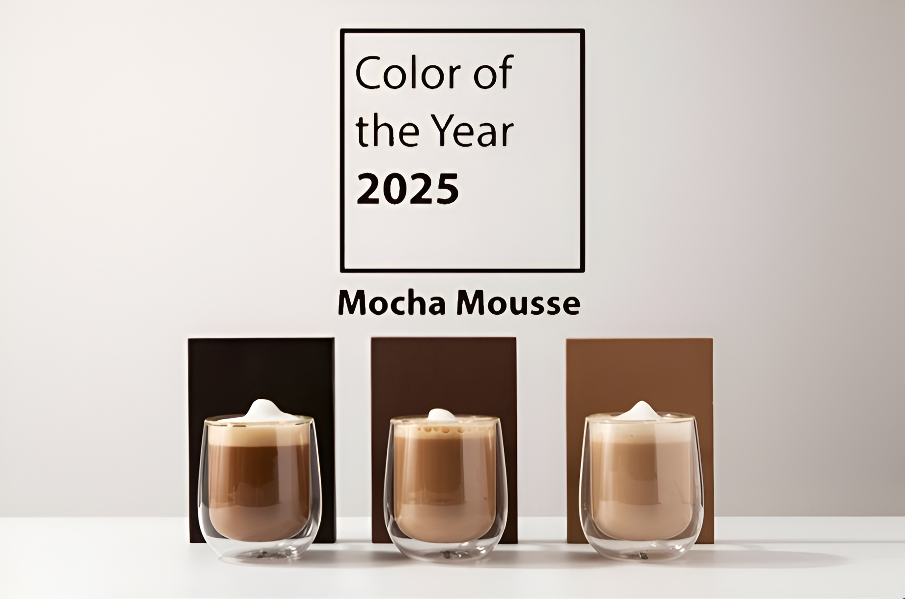
Pantone’s Color of the Year for 2025 isn’t a shout across the room. It’s a warm, grounded voice that says, “Slow down, I’ve been here all along.”
Pantone’s pick for 2025 Mocha Mousse (PANTONE 17-1230) isn’t trying to be the life of the party. It’s the guest who makes the party better just by being there. This velvety brown wraps itself around moments we don’t want to rush: the steam rising from a fresh cup of coffee, the earthy scent after rain, the reassuring weight of a leather-bound journal. In a year of constant motion, this color invites stillness.
Rooted in Nature, Not Marketing
Earth before hashtags
“Nature always wears the colors of the spirit.” – Ralph Waldo Emerson
Mocha Mousse draws its strength from the earth literally. Its tones recall cocoa beans, fertile soil, and tree bark. This isn’t the “green” you see on tote bags or in sustainability slogans; it’s nature as a quiet constant. Designers in 2025 are leaning toward materials and palettes that feel as if they could exist without hashtags, and Mocha Mousse fits that bill. It’s not performative it’s instinctive.
A Color Fluent in Emotion
Trust with a modern accent
“People will forget what you said, but they will never forget how you made them feel.” – Maya Angelou
Browns have long stood for trust and stability, but Mocha Mousse updates the language. It’s refined without being aloof, and approachable without being plain. Think of a tailored coat that doesn’t intimidate or a well-worn chair that still looks elegant. The emotional pull is subtle: a steadying presence in a world that keeps leaning toward extremes.
A Timeless Traveler
Beyond decades, beyond trends
“Fashion changes, but style endures.” – Coco Chanel
Mocha Mousse doesn’t care if your inspiration comes from a 1970s vinyl lounge or a 2040 minimalist workspace. It works in both, and in the liminal spaces between. It doesn’t chase trends it quietly sits in the room until the trends come back around to it. For creatives, that’s gold: a color you can invest in without fear of seasonal expiry.
Designing With Mocha Mousse
From palette to presence

Mocha Mousse behaves differently depending on where you place it, but it always brings the same quiet authority. On walls, it’s the visual equivalent of a deep breath steadying, grounding, and impossible to rush past. Pair it with muted greens, terracotta pottery, and natural linens and a room becomes an anchor point in a restless world. Introduce brass or gold and it tips into understated glamour, the kind that makes a space feel designed without feeling staged. It’s not loud, but you notice when it’s missing.
That same confidence carries into fashion. Mocha Mousse gives fabric a richness that doesn’t need to compete with louder colors, but instead makes them sharper, more deliberate. Think suede trench coats, silk scarves, or perfectly tailored trousers it’s a neutral with gravity. Jewel tones like ruby or sapphire, which can overwhelm lighter shades, find their balance here.
 It’s not a background color. It’s the co-star.
On screens, Mocha Mousse offers relief from the retina-burn of hyper-saturated UI trends. It lends interfaces a human touch, grounding layouts so text feels more readable and buttons more intentional. When used as a background, it makes content feel tactile and trustworthy. Paired with clean sans-serif fonts and generous spacing, it creates an experience that feels as considered as a printed page, making users want to linger rather than scroll past.
In branding, Mocha Mousse tells a story before the first word is read. It communicates reliability and warmth, suggesting a business that values substance over spectacle. Luxury coffee roasters, boutique hotels, and artisan leather goods brands can all leverage this hue to signal craft and care.
Against vibrant accent colors or even minimal black-and-white palettes, it adds depth the visual equivalent of a firm handshake and steady eye contact.
Why It Resonates Now
Built for slower living
“The details are not the details. They make the design.” – Charles Eames
Mocha Mousse’s rise mirrors our cultural hunger for slower, more intentional living. We’re seeing a move away from “fast” design fleeting visual hits meant to grab attention and toward colors and forms that earn a place over time. It’s a return to the idea that what surrounds us should be built to last.
Designers’ Recommendation
Using Mocha Mousse With Purpose
Don’t treat this color as background noise. Give it space to be noticed whether that’s a statement wall, the hero piece in a wardrobe, or the foundation of a brand’s visual identity. Pair it with textures: velvet, unpolished wood, raw stone. Contrast it with both soft neutrals and high-saturation accents. Above all, use it with the kind of intent the color itself represents.
Reading Inspiration
Dig deeper into its emotional, cultural, and design context
- Dezeen – Sustainable Materials Showcase: “Inspiration for pairing earthy hues with tactile, eco-conscious finishes.”
- Johannes Itten – Elements of Color: “Classic color theory principles for timeless combinations.”
- Kassia St. Clair – The Secret Lives of Color: “A brilliant exploration of how colors shape history and culture.”
- Pantone – Official Color Trend Report 2025: “Insights into how Mocha Mousse fits into broader palette movements.”
Final Thoughts
The power of quiet color
Mocha Mousse whispers where other colors shout, and that’s its power. It gives designers a way to create work that feels lasting without feeling dated. It’s elegance without pretension, warmth without clutter, sophistication without distance. In 2025, it’s not just about the colors we see it’s about the colors that stay with us.
References
- Pantone Color Institute (2025): Pantone Color of the Year 2025
- Emerson, Ralph Waldo (1836): Nature
- Angelou, Maya (1982): Public lecture
- Chanel, Coco (2011): The Gospel According to Coco Chanel
- Eames, Charles (1998): Eames Design: The Work of the Office of Charles and Ray Eames