“Mere color, unspoiled by meaning, and unallied with definite form, can speak to the soul in a thousand different ways.” – Oscar Wilde
Peach Fuzz: The Color Hug of 2024
What Peach Fuzz Tells Us About Future
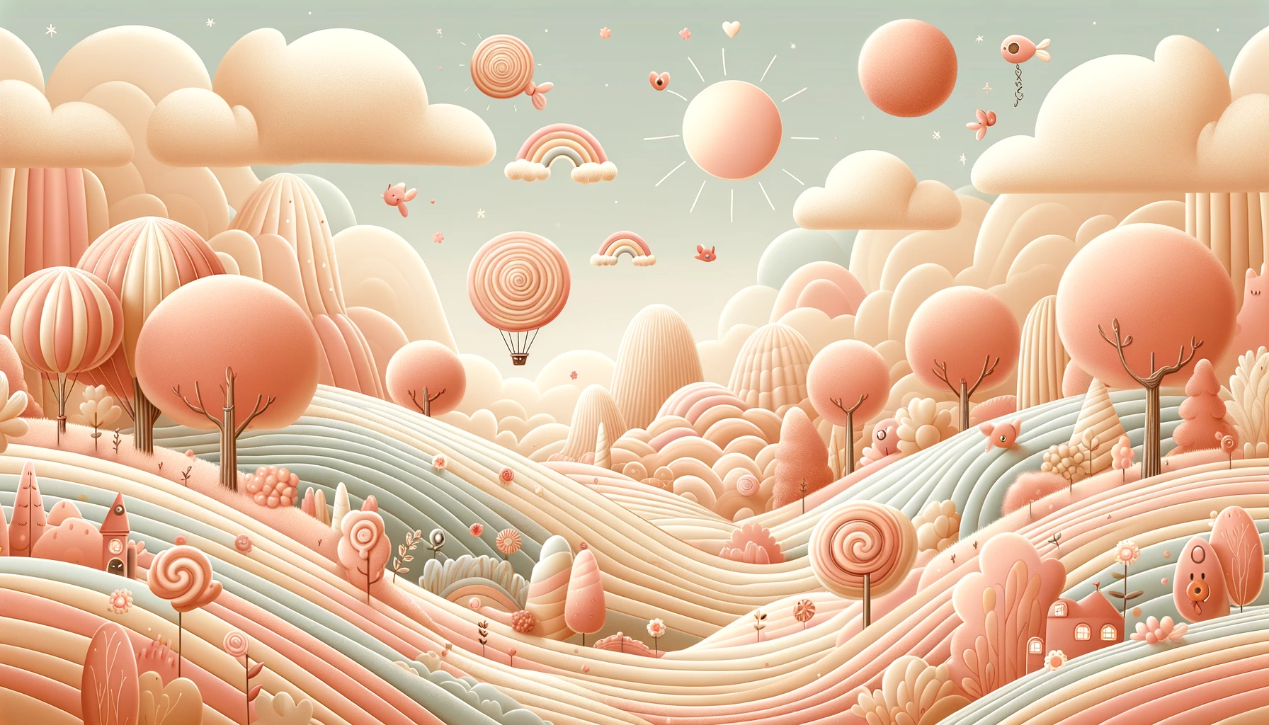
Peach Fuzz isn’t just Pantone’s 2024 Color of the Year it’s comfort in a shade. Think of summer light at 7 p.m., warm, soft, and quietly optimistic.
The Psychology of Peach Fuzz
Why this shade feels like a hug
Leatrice Eiseman, Executive Director of the Pantone Color Institute, explains:
“In seeking a hue that echoes our innate yearning for closeness and connection, we chose a color radiant with warmth and modern elegance. A shade that resonates with compassion, offers a tactile embrace, and bridges the youthful with the timeless.”
Peach Fuzz goes beyond aesthetics. It symbolizes connection, resilience, and a softer vision of the future an emotional anchor in design, fashion, and culture.
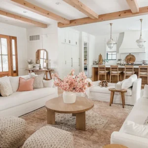
Peach Fuzz in Design
From moodboards to living rooms
Designers are already obsessed. In interiors, Peach Fuzz turns sterile spaces into inviting sanctuaries. Pair it with neutrals for minimalism with warmth, or let it clash with deep blues and greens for a punchy modern edge.
Brands are catching on too. Expect packaging, websites, and campaigns dripping with Peach Fuzz in 2024. It signals openness and approachability exactly what consumers want from companies right now.
Peach Fuzz in Fashion
Runways, closets, and TikTok OOTDs
On the runway, Peach Fuzz is proof that elegance doesn’t need to shout. It works in monochrome outfits for a sleek, future-forward look, or as an accent in accessories for a subtle nod to the trend.
Influencers are already calling it “the softer cousin of Barbiecore pink.” Peach Fuzz is less “Malibu Dreamhouse” and more “quiet luxury with a playful wink.” Basically, it’s the color equivalent of a linen suit with sneakers.
Pairing Peach
Friends don’t let Peach go out alone
-
With neutrals: Crisp whites, beiges, and tans for elegance.
-
With bolds: Navy, teal, or emerald green for high contrast.
-
With itself: Layer tones of peach for a soft, monochrome dreamscape.
Designers are calling this a bridge color—a hue that connects youthfulness with timeless elegance.
Cultural Resonance
Why this color matters now
Peach Fuzz isn’t just about aesthetics it’s a mood board for society. Coming out of years of uncertainty, people crave connection, kindness, and calm. This color reflects that yearning, bridging nostalgia (grandma’s peach pie) with modern sophistication (your favorite lifestyle brand’s packaging).
It’s the color of community, of leaning in, of choosing empathy over endless hustle.
Sustainability and Nature
Peach Fuzz as an eco-reminder
Pantone’s choice also whispers of sustainability. The peach tone nods to the natural world orchards, sunsets, earth’s warmth. It’s a reminder that color, like culture, is cyclical. As we embrace Peach Fuzz, we’re also leaning into more mindful consumption and eco-conscious design.
DIY with Peach Fuzz
Because sometimes you need it in your own hands
 This shade is perfect for small creative projects. Think custom wall art, upcycled furniture, or even hand-dyed fabrics. It’s approachable enough for craft beginners yet chic enough to make the results look intentional.
Pinterest boards are already filling up with “Peach Fuzz aesthetic” DIYs, proving this color isn’t just for big brands it’s for anyone with a paintbrush and a free Saturday.
Tech Meets Peach
Yes, even gadgets want to glow up
Just like Viva Magenta had Lenovo and Motorola pushing immersive “Magentaverse” experiences, expect tech brands to play with Peach Fuzz too. From phone cases to UI palettes, tech loves color-of-the-year hype. Don’t be surprised if your next smartwatch wallpaper screams Peach Fuzz minimalism.
Looking Ahead
What Peach tells us about future palettes
Peach Fuzz points to where design trends are heading: toward colors that provide emotional depth, not just visual impact. Expect more tones that feel personal, nurturing, and rooted in calm colors that don’t just look stylish but also help people feel okay.
It’s not escapism. It’s empathy, bottled as pigment.
Exploring the psychology
Design, and cultural impact of Peach Fuzz 2024
- Leatrice Eiseman — Color Harmony in Design: “The queen of color theory turns palettes into poetry.”
- Pantone Institute — Pantone Viewpoint: Peach Fuzz 2024: “A softer-than-latte shade takes the crown.”
- Psychology of Aesthetics Journal — The Emotional Life of Color: “How hues shape mood, memory, and Monday mornings.”
- Vogue — Quiet Luxury and the Return of Soft Power Colors: “Muted tones whisper louder than bold ones ever could.”
Final Thoughts
A Color for the Future
Peach Fuzz isn’t just a shade it’s a cultural statement wrapped in sherbet tones. It reminds us that softness has power, that comfort has elegance, and that the future of design is less about domination and more about connection.
In 2024, color is more than what you see. It’s how you live in it.
References
- Pantone Color Institute (2024): Pantone Color of the Year 2024: Peach Fuzz
- Eiseman, Leatrice (n.d.):The Complete Color Harmony: Expert Color Information for Professional Results
- Vogue Magazine (2024):Why Peach Is the Unexpected Power Color of 2024
- Psychology of Aesthetics Journal (2023):Color and Emotion: The Science of Comfort Hues